SPRING / SUMMER 2011 = SPRING / SUMMER 2026

Phoebe Philo's dazzling ascent at Céline serves as inspiration for the recent collections

Cast your mind back to the Spring Summer 2011 collections. To Céline to be exact. Phoebe Philo, recently installed as creative director, dropped her most definitive collection to date for the house. A collection so precise and assured it set the aesthetic pulse for the next ten years. It stood out like an exclamation point in a sea of bodycon dresses and retro throwbacks. It had everything: structure balanced with fluidity, the reveal / conceal dichotomy held in perfect equipoise, monochrome shot through with bursts of intense color and pattern. Denim, leather and silk. But most of all it had attitude. Sure, there were contemporaries: Raf Simons at Jil Sander and Prada spring to mind. But neither seemed to capture of the moment quite like Philo. Her Fall 2012 was a spectacular display of punk tinged modernism, revealing her to be a master colorist. Spring 2013’s controlled abstraction set the bar even higher. For Spring 2014, she dove head first into the style of midcentury abstract painting with big, sweeping swaths of color (its imprint is all over this season). It was marvelous. Céline’s dazzling ascent was down to Philo’s ability to articulate the aesthetic desires of the time. Her exit from fashion in 2018 capped off a near eight year reign where the very mention of Céline (with the accent acute) was synonymous with damn good taste.

And now, 15 years later it seems Philo’s proposals for Céline have found a home in fashion, mostly propelled by the reshuffling and new arrivals of various creative directors from one house to another.Bottega Veneta set the tone for what would proved to be a very exciting season. Louise Trotter injected kinetics into her debut: fringe, fuzz, and frou-frou fluttered on garments and accessories. Tops and skirts dazzled like fireworks, their spiky, luminescence creating explosive flashes of artifice activated by movement. The brand’s signature intrecciato added a tactility to garments, especially on the outerwear. There was a crisp outline to the tailoring, articulated but relaxed. Splashes of Ellsworth Kelly color, most effective in red, added punctuation. Trotter’s techniques with leather went beyond the expected when a massive fringed poncho dragged across the floor and skirt hemlines swerved asymmetrically askew. It was a brilliant debut for Trotter and a victory for the house.

Loewe’s Jack McCollough and Lazaro Hernandez’s also referenced the great colorist of the modern era like Blinky Palermo and John McCracken with eye popping jolts of saturated pigments. Glossy heat sealed leathers looked “moulded’’, devoid of superfluous detailing, sleek and futuristic, as if dispatched from an assembly line. Two dresses, their front a void of black, were trailed with fluttering colorful, Calder-like wings. Two others sported Morris Louis rivers of color. At times, the collection recalled the techno-sexy style of Helmut Lang with its emphasis on synthetics and fabric experimentation. There was a playfulness with the collection which felt fresh and energetic. McCollough and Hernandez brought an effortlessness to the house, a lightness, which was invigorating.

Pieter Mulier produced his best collection for Alaïa since his appointment as creative director for the legendary maison in 2022. He certainly proposed the freshest garment of the season: fringed leggings. Worn in lieu of trousers, their whiplash dynamism had not been seen since the Swinging Sixties. Coats and tops were maxi-minimal, pure volumes in pure colors, bold and austere. Cocoon-like jumpsuits created a new silhouette, gathered in soft pleats at the knee. Mulier’s way with softness, especially with coats, offset any notions of minimalism being chilly or strict. Skirts and dresses, falling in asymmetrical folds and ripples, revealed skin in a ways beyond the house’s codes of cling. Draped pannier style skirts in emerald and apricot made for a memorable finale. Mulier has come into his own with this collection. He was quoted as saying he wanted Alaïa to be “a house like no other”. Mission brilliantly achieved.

Most wouldn’t expect pools of pure color at Maison Margiela but that’s what happened with the brand’s Fall 2007 collection. Having exhausted his deconstructionist approach, Martin Margiela turned to his childhood inspiration Courréges, whose space-age designs branded him a futurist. With nary a raw seam in sight, Margiela refracted his codes (strong silhouette, trompe-l’oeil, nude, etc.) through a lens of clean, uninterrupted forms. It was as outstanding triumph for the brand and for fashion in general, influencing many designers, Philo notwithstanding. Had Glenn Martens, the brand’s newly installed creative director, followed this lead for his ready to wear debut, it would have dovetailed with fashion’s current l’air du temps of minimalism, structured, architectural forms, texture and undiluted pigments. But then again, Masion Margiela has always been a singular proposition, apart from the pack.

Sarah Burton gave us gams galore at Givenchy, proving minimalism can be sexy and alluring. One is always aware of the woman beneath the modes when unexpected openings reveal a bare back, or when costumes are paired with bras. Her cropped, double lapel black leather jacket, a design which made its debut with the previous season, was worn over a bodysuit with a plunging neckline. In a palette of mostly black and white, she doused her models in liberal splashes of silver jewelry: constellations of sparkling squares adorned the décolleté and dangled from lobes and wrists. An intense scarlet jigged the retina on a frothy babydoll and strapless minidress, its top tied around the bicep. Givenchy’s woman is confident and assured and owns her femininity regardless of age. Burton’s casting of some of the most beautiful mannequins of the last thirty years made it plain. Élize Crombez, Mariacarla Boscono, Eva Herzigová, Małgosia Bela, Jessica Miller, and the ultimate supermodel Naomi Campbell, all strutted their stuff with an élan only time can bring.

Michael Rider presented a clearer vision at Celine than his resort debut. His exacting eye, when it comes to silhouette, is noteworthy. Blazers had a sharp shoulder formality reminiscent of the 1930s and it looked especially fresh when worn with sprayed-on jeans. There was an emphasis on black, focusing attention on his shapes and proportions. Trench coats held the surprise of baroque scarf prints on their linings, and the humble rugby was elevated in silk and bisected with contrasting colors. Monochrome dresses, worn over full trousers, had multi colored stripes on one sleeve, in sync with the season’s obsession with color blocking. There was an exploration of drape which added depth to the proceedings. Rider’s approach at Celine is aligned with Philo’s proposals and the brand is better for it.

The standout collection of the season must go to Balenciaga. Pierpaolo Piccioli’s starkly minimal creations recalled the haute elegance of the house’s founder with an assuredness which only comes from skill and experience. And as Cristóbal Balenciaga’s avant garde proposals stood at odds with the tweedy skirt suits of Chanel and the waspish severity of Dior, so does Piccioli’s precise lines, mastery of drape, and dramatic use of color, stand as an antidote to some of the noisy yet banal players populating the international fashion weeks. A swoop of circular black leather magically rests on the shoulders to create a jacket, resurrecting the architectural wonders of the house’s legacy. Dresses and tops terminate in an angular point. Sparkly fringe spring forth with champagne effervescence. Trousers, ending below the knee, balloon to twice their size with the aid of pleats. Tummy revealing tops add a flash of sexiness to the structured forms. Opera length gloves, in pink, burgundy, black and white, added a sophisticated glamour. And like Philo’s Céline, the collection had attitude. Piccioli’s Balenciaga is resolutely modern. And intelligent. It was new chapter for Balenciaga. May it light the way for a new direction for fashion.

Melanie Ward: In Memoriam

Within The Face’s March 1990 issue a new mood was prophetically declared with an eight-page editorial. It featured the work of photographers Corinne Day, David Sims, Glen Luchford, stylists Karl Templer, Adam Howe, and Malcolm Beckford, and models Emma Balfour and Kate Moss. In the story, with each photographer submitting a picture or two, there’s an emphasis on sportswear and denim worn by fresh faced models and non models casually posed. Although the tagline made plain that “the prevailing statement now is understatement,” the editorial is remarkable for being unremarkable. It was easy to dismiss as a “fashion” story, which was the point.

The British stylist Melanie Ward was not part of that editorial, but she would come to define the understated look it espoused. Her styling was devoid of shiny 1980s glamour that was being crossed out by the new mood of grungry realism. Her models lacked visible makeup, their hair were lank and unkempt, clothing rumpled and minimal. They were pale and very thin, the opposite of the towering glamazons of the previous decade.

Working with Day and Sims, Ward produced a series of stripped down looks between 1990 – 1992 in The Face and i-D that would change the course of fashion. It may not have looked like it at the time but she was far ahead of the curve in determining what the 1990s (and beyond) would look like. Her styling, a mix of vintage garments, uniforms and designer pieces by the likes of Martin Margiela, Helmut Lang, and John Galliano, did not scream luxury. And perhaps crucially, her proposals were relatively easy to replicate for her disaffected Gen X audience. But by pairing sneakers with nearly everything, a radical proposal in the early 1990s, she created new possibilities in fashion. Like stylist Ray Petri five years prior, she dissolved the barriers between clothing categories, freeing the wearer from the imposed, dogmatic rules of fashion. She handed the reins of style to the individual.

One of her earliest, and certainly most important stories, was in The Face July 1990 with Kate Moss, shot by Corinne Day. Entitled “The 3rd Summer Of Love”, a reference to the acid house raves then sweeping the UK, the black and white images are about as far away from the traditional fashion imagery of the 1980s as one could imagine. In a selection of designer and vintage tops, white denim, sport shorts and Birkenstocks, the style is minimal but considered. And it would set the stylistic template for the decade.

Ward understood design. She understood fit, proportion, and silhouette. She recut a pair of Levi’s shorts to ride lower on the hip for a shoot in the February 1991 issue of The Face. The re-introduction of that 1960s shape would be adopted by Helmut Lang and Calvin Klein, both of whom Ward would later work with, and which would be taken to extremes by Alexander McQueen. And she also understood menswear. In the May 1991 issue of The Face, a young man with a shaved head wears a narrow shouldered, two button blazer with low slung, straight legged corduroy jeans. Lean and spare, the look bore no traces of the inflated men’s fashion of the 1980s and was endlessly adopted by various designers. But it is Ward and Day’s “England’s Dreaming” editorial from The Face August 1993 which produced the definitive image of grunge: model Rosemary Ferguson in a men’s two button suit, vintage t-shirt and scruffy, unlaced sneakers, staring pensively towards the ground. With a few simple pieces, Ward skillfully combined tailoring and sportswear, vintage and new, masculine and feminine, into an image of vibrant modernity which still resonates today.

The Face declared Ward and Day harbingers of a new aesthetic with “Young Style Rebels, London’s New Model Army,” on the cover of its June 1992 issue. This would also be the final year of her style, now known as grunge, as an underground phenomena, soon surfacing at bigger glossies both in Britain and America. Although Vogue and Harper’s Bazaar preferred a softer, prettier version of grunge, their adoption of the style signaled Ward’s relevance as an image maker. It was also the year when brands began to seek her styling and consulting services, Helmut Lang and Calvin Klein in particular. For her Calvin Klein Jeans and Underwear campaigns shot by Sims, Ward added a little studded bracelet to Moss’ wrists, a subtle touch of punky subversion at the American conglomerate. She injected a dose of London cool to Lang’s Spring – Summer 1994 catwalk by shaking up his by casting. Ward’s styling helped turn Lang into one of the most influential and coveted brands of the ‘90s. She would continue collaborating with him until Lang’s retirement from fashion in 2005.

In 1996, Ward became senior fashion editor of Harper’s Bazaar. The magazine had undergone a radical transformation in 1992 when newly appointed editor in chief Liz Tilberis hired art director Fabien Baron to restore the magazine to its former modern heyday under Alexey Brodovitch. Ward’s modernist style was key to positioning Bazaar as one of the most directional fashion magazines of that decade, offering American readers an alternative to staid classics. Her editorial with Steven Klein in the December 1996 issue with models Emma Balfour and Amy Wesson in primary colored bodycon looks, unkempt hair and painted lips, is representative of Ward’s sensibility. The same can be said of her story with photographer Patrick Demarchelier in the February 1999 issue with model Erin O’Connor, her bare face offset by a severely geometric haircut as she strikes angular poses. Ward’s position at such a prominent magazine cemented grunge aesthetics into the fashion vernacular where it remains potent and omnipresent.

Ward’s trajectory through fashion reveals how new proposals, when anchored in uncut realism, can change the status quo even if they are initially perceived as radical. In her final years, she worked with mainstream brands like Versace, Hermes, Dior, and Fendi. Ward’s initial proposals of anti-glamour realism, so at odds with the lustrousness of fashion at the time, eventually took her to the heights of established fashion where glamour remains an essential constituent. Ward remained slyly subversive to the end.

Yves Saint Laurent and Photography

Inside Yves Saint Laurent and Photography you’ll find some of the most iconic fashion images of the 20th century. Images so recognizable and potent they are part of the pop cultural visual language. Saint Laurent, that most lauded of créateurs, delivered couture collections of such devastating modernity from 1962 -1975, they simply defined the look of the 1960s and 70s. And they also inspired some of history’s greatest fashion photographers as well: Richard Avedon, Jeanloup Sieff, Guy Bourdin, Franco Rubartelli, all contributed to the legacy of the storied maison. Saint Laurent wisely partnered with seasoned photographer Helmut Newton early in his ascent, and together they built up a body of work synonymous with each other. Newton, known as the King of Kink, became the “eye” of the house. And it is his photograph of Vibeke Knudsen on Rue Aubriot at night that arrests. First printed in the September 1975 issue of Vogue France, it is quite possibly THE defining image of Parisian fashion in the 1970s. 

Saint Laurent was a bona fide fashion star in 1975 and it was a pivotal year for him. Forever at the edge of the zeitgeist, he released Eau Libre, one of the first unisex colognes. The advertising tested the limits of European bourgeois taste by featuring a Black man and white woman together. Four years earlier, he stripped bare for Sieff's lens for his new cologne, Pour Homme Eau de Toilette. With his androgynous, Christ-like locks and chiseled physique, he became an unwitting pinup for the nascent Gay Pride movement. “I want to shock” he told Seiff at the time. “I want a scandal.” 1975 was also the year he broke with his modernist style for a more historicist approach. 

After setting up his eponymous brand with his partner Pierre Bergé, Saint Laurent steered fashion away from Christian Dior’s post war, hourglass silhouette with a precision that left little doubt who was in charge. But from FW 1976 onwards, his collections became ornate and decorative. Their lushness, ecstatically, received, set the stage for the lipstick and lacquer styles of the 1980s (a decade he lorded over). But it also meant that his days in rigorous pursuit of absolutely modern clothing, that is to say, clothing charged with the essence of “now”, had come to an end.(In 1971, when asked by a journalist which garment he wished he would have designed, he replied “blue jeans”.) Yet in retrospect, his volte-face towards historicism in 1975 proved that, once again, his antenna was accurately attuned to the times as both “Modern” and “Modernism” was perceptively grinding to halt.

The cover of the book however shows a thoroughly Modern(ist) Yves. Shot by Harry Meerson in 1966, the images were used as promotional material for the opening of his first Rive Gauche boutiques. The Pop Art inspired session also reveal the once timid boy of couture matured into a confident young man, one making a mark on culture. He followed the wild success of Rive Gauche with Pour Homme in 1969 with black leather, double-breasted maxi-coats in the year of Woodstock, Altamont Free Concert, and the Manson Murders. His much ballyhoo’ed SS 1971 haute couture collection of 1940s floozies practically invented the concept of “retro" although it wasn’t received that way at the time (“retro” had been an underground trend since 1968). ”He was like a sociologist” said Betty Catroux, his close friend and muse. “He absolutely understood his time” 

And he was no slouch when it came to personal style either. His slim, long limbed frame seamlessly embodied the swinging menswear styles from 1964 - 1975. A photo of him taken by Bergé in 1967 finds him strikingly handsome as he reclines on a beach in mod white. A few years later he’d wear his Saharienne, a laced front tunic he originally designed for women, sparking the Unisex trend of the late Sixties (Franco Rubartelli’s 1968 picture of German supermodel Veruschka wearing a Saharienne and holding a rifle over her head is yet another iconic image of 20th century fashion indelibly linked to the house). At home in Paris and Marrakech, he’d lounge around bearded in a thobe. “If I weren’t a designer, I would have liked to have been a beatnik” he said. But instead, Saint Laurent was the biggest and brightest fashion designer of the Modern Era. 


Yves Saint Laurent and Photography

Phaidon, 160 pages, with 145 color and black and white images

Guy Bourdin For Charles Jourdan


Guy Bourdin’s 30 year collaboration with Vogue France began in 1955, where he was hired by editor and chief Edmonde Charles-Roux. In one of his first photos for the magazine, a model daintily holds the tips of her white chapeau, staring sweetly at the lens. Above her hangs five severed calf's heads, their lifeless tongues extended, as curved hooks penetrate the tops of their heads. It is an arresting image, and it would not be Bourdin’s last. Before running the picture however, Charles-Roux instructed the art director to crop out the decapitations, leaving only the model’s softly elegant gaze. Perhaps 1955 was too early for such explicit visualizations of sex and death.

Bourdin, proclaimed by highly respected Photo magazine as “the photographer of inventiveness, of the imagination,” is one of the most important and influential fashion photographers of the 20th century. His mastery of color (he began his career as a painter) is perhaps matched only by William Eggleston. His art direction and composition, unparalleled. His ability to craft a scenario, often surreal, sexy and subversive all at once, within a single frame, is peerless. Under the unyielding support of Francine Crescent, Charles-Roux’s successor, Bourdin flourished, making Vogue France the undisputed queen of fashion magazines in the 1970s, his technicolor editorial and advertisements fantasies hotly anticipated each month, though not with controversies. 

Bourdin’s work caught the eye of Roland Jourdan, the son of Charles Jourdan, who established a namesake shoe brand in 1921. The brand’s success from the 1950s onwards stemmed from its flexibility in sizing and colorways, and its positioning within the the haute couture establishment (both Christian Dior and Pierre Cardin were clients). Their understanding of good promotion in the press was also key, and they secured prominent positions within Harper’s Bazaar and Vogue France. Bourdin’s cover of Vogue France’s March 1966 issue featuring a red miniskirt, red tights and red Pierre Cardin shoes led Jourdan to hire Bourdin, sparking a twelve year collaboration (1967 - 1979), in which Bourdin effectively served as de facto creative director for the brand.

The new book Guy Bourdin For Charles Jourdan, published by Rizzoli, captures this stellar collaboration with 150 color photographs that serve as an excellent overview of Bourdin’s best work. All of Bourdin’s obsessions are there: the blood-soaked reds, glinting pops of sunlight, endless fields of verdant grass where models recline seemingly unaware of Bourdain’s voyeuristic lens, the luxurious but cold boudoirs where games of lesbian dominance and submission unfold.. all with Charles Jourdan shoes, of course. The book is a shoe fetishist's wet dream.

His campaigns from the late Sixties are exercises in perspective and proportion: a gigantic yellow shoe stands majestic in a hotel corridor among pairs of men's black loafers, a model toys with a miniature red one, her red nails and lipstick in the exact hue. Things heat up in the 1970s. Hired to shoot the campaign for couture maison Patou, his double page advertisement of a red wedge on the left, and an unplugged outlet oozing with blood on the right, prompted the fashion label to cancel his contract without an utterance. Bourdain’s campaign from March 1975 in Jours de France of a pair of pink shoes haphazardly spilled on the sidewalk in front of a chalk outline of a woman's body drew letters of outrage and disgust from readers. 

Not all of the photos are as macabre. His series of dislocated mannequin legs strutting through gardens and cityscapes in heels are surrealistically humorous. A pair of shoes seem to spontaneously ignite into sparks on a beach boardwalk. And, in a spectacular feat of color and composition, a model lies topless on sparkling green astroturf, her vermillion hair echoing the shape of an electric blue pond with three tiny goldfish, a lone black wedge beside her face barely present amid the riot of polychromy.

We have Roland Jourdan to thank for his willingness to trust Bourdin’s visual manifestations of renegade glamour. Even in moments of hesitation, Jourdan did not reject any of Bourdin’s proposals, understanding that risk taking must be employed in order to break new ground. And break new ground is precisely what Charles Jourdan’s campaigns achieved by bucking the formulaic template of the product as the center of the image. “We had to protect him because he was a true artist”, Jourdan said of Bourdin in 1995. “Today, I would not be able to work like I did with him”. Indeed. Guy Bourdin For Charles Jourdan stands as a document to a time when the restraints of commerce gave way for art to forge new territories, shattering boundaries and a few nerves in the process.


Guy Bourdin for Charles Jourdan

216 pp, 8 ¼ x 11 ½ inches

150 color photographs

Hardcover $75.00 Rizzoli


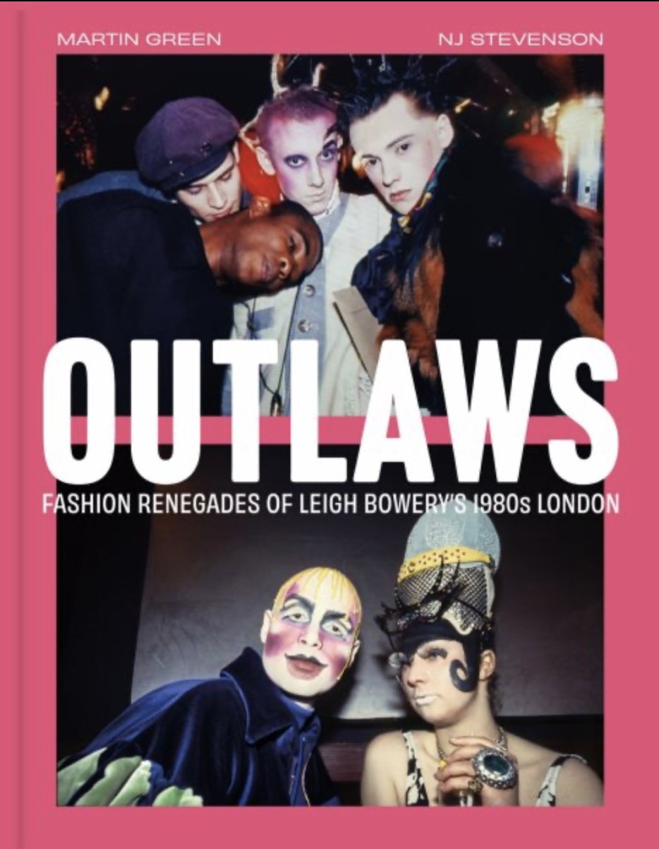
OUTLAWS: Fashion Renegades Of Leigh Bowery’s 1980s London


Punk. That burst of angry, youthful energy unleashed on London streets in 1976 indelibly changed the trajectory of nightclubbing forever. For about eighteen months, sartorial individuality reigned for those initial participants. Although Westwood and McLaren’s SEX and Seditionaires boutique provided expensive garments infused with the spikily subversiveness forever associated with punk, DIY styling rose like a rocket within those months with a slew of customization ideas utilized to express disaffection, nihilism and sexual deviation.

But it would not last. Punk quickly became a uniform (black leather jacket, choppy hair, etc.) and the promise of a fabulously individualistic future faded by 1978. One of the disappointed, the illustratively named Steve Strange, and his friend DJ Rusty Egan, decided to do something about it by starting a “Bowie Night”, every Tuesday, at a tiny club in seedy Soho called Billy’s in the autumn of that year.

Billy’s brought back the individuality craved by its denizens. The scene grew and moved to Blitz wine bar in Covent Garden after a year, becoming an incubator for the creative movers and shakers who would shape the following decade. The sartorial one upmanship reached stratospheric heights when hundred year old costumier Charles Fox closed its doors in 1980, selling off its stock for pennies on the pound. The press became enthralled by the peacockery, dubbing them the New Romantics, a title they hated. But the die had been cast and the club kid was born.

Leigh Bowery got wind of nocturnal London’s colorful characters and decided to up sticks to the English capital from Sunshine, Australia in 1980. i-D, The Face and Blitz were all born that same year, putting the party participants on their covers. It would be seven years before Bowery would land the cover of i-D, but he would grace their pages as early as 1983.

Although the flounces and bows associated with the New Romantic look all but disappeared by the end of 1981, extreme sartorial expressions did not. Cha Cha, which opened in ‘81 in the back of Heaven, Europe’s largest gay disco, was hosted by angular Blitz habutée Scarlett Cannon and future stylist extraordinaire Judy Blame. Cha Cha would be Bowery’s entré into café society, confirming his desire for outlandish presentation. Philip Sallon, whose flamboyant appearance pre-dated punk, hosted the wildly successful Mud Club in 1983, providing a more legitimate space for the exotically clad. That same year, Bowery began to make waves on the nightclub scene as a blue faced spectacle in stripy tights and ass revealing jacket. 

Bowery launched his own club night, Taboo, in 1985. Initially sluggish, it exploded after a few months, becoming the hottest and most difficult club to gain access to if you were not dressed to the nines. Its run was brief, about a year, brought down by drug use and deaths. But at its peak, it was the most colorful playground of stylistic expression London had ever seen. And what did they wear? Perhaps a jacket trimmed in bobby pins or a pair of frilly underwear as designed by Bowery himself? Or maybe John Crancher’s white maxi coat with bondage straps or Bodymap’s stretchy, stripy jerseys. Dean Bright’s sumptuously velvet creations as worn by singer Pete Burns of Dead Or Alive in their video for “You Spin Me Round” might have gotten you past Marc Vaultier, Taboo’s notorious doorman. It could have been one of Pam Hogg’s color blocked, body skimming catsuits designed to make one look like a futuristic Emma Peel. Maybe a Christopher Nemeth jacket upcycled from old mail sacks, topped off with one of Judy Blame’s berets festooned with buttons and ribbons. A John Galliano jacket from his Ludic Game collection, abbreviated to barely there proportions? Stephen Linard’s biker jacket in orange and black faux tiger fur would have looked good on the amyl scented dancefloor. One of Richard Torry’s ingeniously laddered knitwear pieces would have surely done the trick. Whatever it was, it has found a commemorative document in Outlaws

Martin Green and NJ Stevenson’s Outlaws: Fashion Renegades Of Leigh Bowery’s 1980s London captures that era’s exciting London club scene. It is a photographic catalogue showcasing the unbridled creative spirit and wiggy, wayward glamour of that era. It also resurrects the names of a few forgotten but undeniably talented creators like John Flett, who invented a new bias cutting technique which infused his garments with a liquid languidness, and Elmaz Hüseyin, who created the clothing for pop group ABC when they reinvented themselves as clubtastic cartoons in 1984. The book closes with “The Afterparty”, a profile of some of the original participants, their sartorial innovativeness intact after decades, a touching way to honor the people who made the styles, and the party, happen.

Outlaws: Fashion Renegades Of Leigh Bowery’s 1980s London 

208 Pages, 81/2 x 14 ¼ inches 200 color illustrations

Published by SCALA ($50.00), out now.

All images courtesy of the publisher


Madame Grès Couture Paris

Madame Grès Couture Paris, recently published by Rizzoli, is the latest book by fashion historian and curator Olivier Saillard. Saillard, whose extensive accomplishments at Paris’ Palais Galleria are credited with invigorating an interest in fashion beyond that of the more established Musée des Arts Décoratifs, is one of the leading voices on the work of Madame Grès. His recent "Alaïa / Grès" exhibition at the Alaïa Fondation, and "Madame Grès, The Art Of Draping” at SCAD last year, continues to further the legacy of one of the most innovative couturiers in the history of fashion.

Grés work is most generally known for her spectacular draping techniques and mastery of pleating. Initially wanting to become a sculptor (“Working in fabric or stone is the same thing for me”), Grés’ used jersey to sculpt designs of such exquisite timelessness they seem to have been handed down through the ages from the most regal of Hellenistic courts. Indeed, a 1936 photograph by George Hoyningen-Huene reveals one of her evening dresses in all of its languid sumptuousness, resolutely proving why her masterful creations inspire so many contemporary designers.

But make no mistake, Grès' work possesses a striking modernity which separates it from her contemporaries. Working directly on the body, never from sketches, her innate sensitivity to the female form produced dresses which were neither restrictive or inhibiting. Instead, they celebrated a woman’s natural curves, following the outline like a caress. The near absence of any decoration and a strict adherence to monochrome underscores the purity of her designs. The highly intricate pleating, both excruciatingly laborious and minutely detailed, belie the ethereal presence of her dresses. Today, we would consider Grès a minimalist, but such finely tuned rigor is rarely found in the work of designers for whom that label would apply.

Notoriously private (she preferred to let her work speak for itself), her lack of communication did not hamper accolades. She was France’s ambassador at the New York World’s Fair (one of her dresses adorned an a relief sculpture from antiquity) in 1940, awarded the Légion de Honneur in 1949, and unanimously elected president of the Chambre Syndicale de la Haute Couture in 1972. A “designer’s designer”, her monomaniacal pursuit of elegance as a destiny warranted the appointments and acclaim.

The photographs, mostly taken from the SCAD exhibition and the Bourdelle museum, are elegantly dressed in shades of greige and soft blacks, creating a feeling as intimate as a couture fitting. Saillard’s extensive yet precise editing over the book’s 128 pages takes us on a journey through Grès body of work where her distinctive and singular vision, so focused and distilled, shows an unmistakable clarity; a signature which could only be hers.

Aside from his short forward, and an equally brief recounting of Grès life by Annie Graire midway through, Saillard allows our eye to simply marvel, page after page, at Madame Grès wondrous output. And indeed, her work does speak for itself.


Madame Grès Couture Paris (Rizzoli, $65, 128 pages) is out now

All images courtesy of the publisher.


CALDER: Sculpting Time


The introduction of movement into sculpture. That implausible leap from the static to the temporal. Alexander Calder, the inventor of the mobile, achieved what the great Hellenistic sculptors could only suggest in the windblown robe and fluttering wings of Nike of Samothrace. He broke the mold. Jean Paul Sartre described Calder’s mobiles as "mid-way between matter and life”. They are a composition of motions, a series of fleeting moments where balance, force and tension coexist in perfect harmony. Calder: Sculpting Time (published by Silvana Editorial, $50.00) covers MASILugano’s ambitious exhibition in 168 pages, highlighting his most prolific era, the 1930s to 1960s.

Calder was born with art in his blood. His mother was a painter, his father and grandfather were sculptors.Young Calder showed an aptitude with his hands at a very young age but was discouraged to pursue art by his parents. He became a mechanical engineer instead, a skill which would later serve him well. But he quickly grew weary of the rigid discipline and lack of play required of engineering and heeded the call of art. Moving to Paris, the birthplace of Modernism, in 1926, he immersed himself in the creative swirl of the artistic community. There he began to produce wire sculptures. They attracted the avant garde, bestowing him with popularity and gallery shows.

Inspired by a visit to Piet Mondrian’s studio in 1930, Calder was compelled to write, “I was very much moved by (it)… with the walls painted white and divided by black lines and rectangles of bright colors, just like his paintings… I thought, how fine would it be if everything there moved". The biomorphic forms and pools of saturated color by artists Juan Miro and Jean Arp also did not escape his eye. 

Calder recalled awakening at dawn on a boat in Guatemala years earlier where he saw both the fiery sunrise and the cool, silver-sheen of the moon simultaneously, making an indelible impression, the beauty of celestial bodies obedient to invisible commands. In 1931 he created Croisière, Sphérique, Densité 1, a miniature solar system of spheres and delicate wires. The world, charged with the exciting breakthroughs of science at that time, announced Pluto had just been discovered and Albert Einstein revealed his theory of relativity. Einstein attended one of Calder’s shows and stood transfixed for 40 minutes while his motorized sculpture, A Universe, completed its entire movement cycle. Calder, like all great artists, understood his epoch.

Calder found the motorized movements of his mobiles elegantly handsome but predictable, without the surprise of spontaneity. Drawing upon his engineering skills and the lyrical poetry of mathematics, he abandoned electricity, allowing air and gravity to guide his sculptures. They acquired a life of their own. They took flight. They became free. They became. “They must not be just a ‘fleeting’ moment”, he said, "but a physical bond between the varying events of life. Not extractions, but abstractions. Abstractions that are like nothing in life except in their manner of reacting”. Calder redefined everything sculpture was, could possibly be, and now is. His stabiles, static sculptures in soaring, aerodynamic forms, reach for the sky, captured at that very moment before weightlessness. They are becoming...

Calder: Sculpting Time pictures his mobiles, stabiles and constellations against an infinite expanse of white, allowing his airy forms to exist without distraction. His innovative introduction of movement and the dimension of time into his sculptures are an immersive experience, a legacy present in time based performances, systems art, and video art witnessed today. His floating chromatic abstractions are the very embodiment of the Modern Era. An era when everything seemed possible. When the shock of the new became quotidian and there was a romantic yearning for tomorrow. 


CALDER: SCULPTING TIME 

Published by Silvana Editoriale

Edited by Carmen Gimenez, Ana Mingot.

Clth, 7.75 x 11.5 in. / 168 pgs / 106 color.

ISBN 9788836657827 

List Price: USD $50.00, CDN $71.00


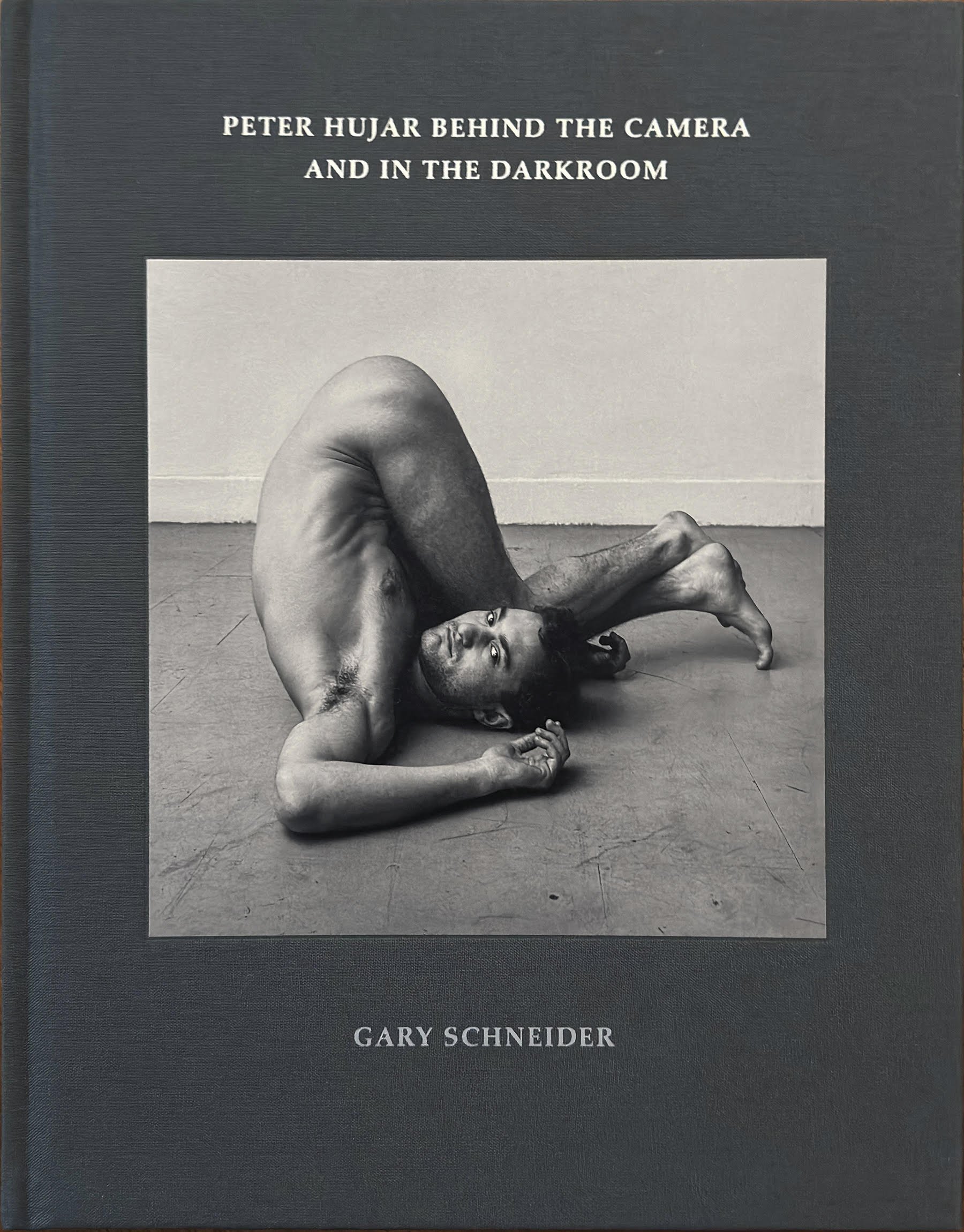
Peter Hujar Behind The Camera And In The Darkroom


Gary Schneider arrived in New York City from Cape Town in 1976, landing a job doing technical work for an avant garde theatre in Soho. Through his partner, he met artist photographer Peter Hujar with whom he had an immediate rapport as he was very interested in photography and printing. Hujar secured Schneider a job at a printers where he began to print Hujar’s work, and in the process becoming a close friend, mentoree, assistant and occasional subject for his lens.

Nineteen Seventy Six was also the year Hujar’s seminal book “Portraits In Life And Death” was released. Now considered a must have for any serious photography connoisseur, the portraits are a who’s who of New York City’s downtown glitterati: writers, actors, filmmakers, and artist, all sensitively captured in various shades of black and white. But it is the hauntingly beautiful images of the catacombs of Palermo, the portraits of death, is where Hujar’s talent with light and shadow is comes into focus.

Schneider discusses Hujar’s remarkable attention to detail, their trial and error, and experimentation with darkroom techniques. Less concerned with simply creating a beautiful picture (although his photography is beautiful) Hujar wanted to control the way information is revealed to the viewer. His work from the 1960s had more contrast, a stark immediacy akin to crime photographer Weegee. But by the Seventies, his obsession with shading, tonality, depth and details produced pictures with a subtle, yet highly controlled narrative. In one of his most famous images, “Boys In Car, Halloween, 1978”, Schneider shows over six pages (a different version of the same image is printed on each page) how Hujar manipulated the negative in order to highlight or subdue what the camera initially captured. It is a delightful revelation and a peek into the mind of the artist.

The centerpiece of the book are of seven rolls of Schneider posing for Hujar's Rolleiflex where he intimately talks us through the experience. Although Schneider’s words are expressed with a with a matter of fact tone, it is a touching recounting of the relationship between artist and muse, albeit however fleeting. Hujar does not direct him throughout the sitting but follows him with his hand held camera. It becomes a dance. Slow and awkward initially, but
in sync after a few rolls. Schneider describes the gamut of his feelings from anxiousness, embarrassment to sexual arousal, and how he wants to please Hujar, looking at him for signs of approval so that he may get the picture he is looking for. An image from the final roll is selected and graces the cover of the book. Schneider, his legs thrown over his head (he practiced yoga) looks passively at Hujar but with an air of mild uncertainty. It is this uncertainty which lends the picture a complexity. It is a celebration of form but not at the sake of sacrificing Schneider’s emotional interiority.

The book concludes with night photographs of cruisers in Stuyvesant Park, in the Summer of 1981. Schneider describes the fun and illicit thrill both he and Hujar experienced that evening. The pictures show New York’s era of sexual permissiveness, where homosexual men found each other in public spaces, right before it would all end with gentrification and AIDS. Hujar would be one of the many causalities of the AIDS epidemic which devastated the artistic and creative communities of its many talents. Schneider’s tender recollection of his long lost friend, told mostly through images, highlights just what was lost. Luckily, we have Hujar’s gracefully
emotive photographs as reminders.